On Thursday, Microsoft announced a change coming soon to some of its most visible software. It will choose a new default font for its Office applications, such as Word and Excel. And that means people will no longer be seeing so much of the font that’s held the default spot since 2007 — a sans-serif font called Calibri.
The change is another indication that this is not the old Microsoft. Since the measured Satya Nadella replaced the loud and proud Steve Ballmer as CEO in 2014, Microsoft has become easier for partners to work with, has strategically embraced third-party platforms instead of stubbornly ignoring them and has morphed into a formidable contender in the ever-expanding cloud computing business. Arguably a change to the look of Microsoft software is in order.
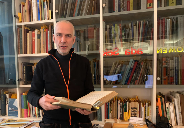
But Lucas de Groot, known professionally as Luc(as) de Groot, the Dutch type designer behind Calibri, was caught by surprise.
“I had not expected it to kind of be replaced already,” he said during a video interview from his home in Berlin.
He said he did not expect to be consulted about the decision and that he’s glad Microsoft invests in new fonts to make its software more valuable. He figured the choice to change was more about keeping up with contemporary style trends than about improving the legibility of Calibri.
De Groot began working on Calibri in 2002. An intermediary had asked him to come up with a proposal for a monospace typeface for an unnamed client. He was not informed that the client had also sought proposals from other people. He was also asked to come up with a sans serif font, and so he sent off some sketches for Calibri in addition to the monospace work.
The client turned out to be Microsoft, which accepted both of his proposals, and in 2003 de Groot traveled to Microsoft headquarters in Redmond, Washington, to meet with designers, advisors and members of the company’s typography team.
At the meeting, de Groot said, he argued that the company should include old-style figures — characters with varying heights — to help with reading, and Microsoft employees agreed.
Coming up with the name was not easy. For both of his fonts, Microsoft wanted names that started with the letter C.
As de Groot put it in an email, “I had proposed Clas, a Scandinavian first name and associated with ‘class,’ but then the Greek advisor said it meant ‘to fart’ in Greek. Then I proposed Curva or Curvae, which I still like, but then the Cyrillic advisor said it meant ‘prostitute’ in Russian, it is indeed used as a very common curse word.” Microsoft legal workers also checked each possible name to see if it had already been trademarked.
The company came up with the name “Calibri,” and when de Groot first heard it, he found it odd. It was similar to Colibri, a genus of hummingbirds. But then Microsoft employees said that it related to calibrating the rasterizer in the company’s ClearType font rendering system.
Once he sent over Calibri, he didn’t know how it would be used. At first he heard it would be included in a programming environment. It wasn’t until a few years later that he learned it would become the default in Office, which has 1.2 billion users. By default, Calibri worked with lining figures with uniform characters, although users can enable old-style figures in Word.
Calibri came to millions of PCs with the release of Office 2007, succeeding the staid 20th-century serif font Times New Roman. Soon, it was everywhere. It became a popular choice for resumes. It has been used to solve forgery cases, and in 2017 it figured in a Pakistani corruption probe ensnaring then-Prime Minister Nawaz Sharif. Former President Donald Trump’s son Donald Trump Jr. used Calibri to release an email exchange about a meeting with a Russian lawyer to gather information on Hillary Clinton, who had run for president against Trump in 2016.
Over the years, de Groot has done additional work on Calibri. He came up with heavier weights, added support for Hebrew, and three years ago, he said, he submitted a prototype for a variable Calibri font, which includes several styles in a single font file, although Microsoft has not released it. He was working on Calibri updates as recently as two weeks ago.
Then he started receiving emails from journalists about the news: Microsoft’s design team had published a blog post on Thursday revealing five fonts it had commissioned, one of which will eventually replace Calibri. Calibri, they wrote, “has served us all well, but we believe it’s time to evolve.”
De Groot couldn’t help but have a look at the five fonts. He downloaded them to his PC and tested them out.
He said he is fond of Seaford, a font developed by Tobias Frere-Jones, Nina Stössinger and Fred Shallcrass of the New York studio Frere-Jones Type. “It has a very strong design, and I would love to see this as the new default,” he said. “It’s not absolutely neutral, but I think it’s a very nice design.”
WATCH: Microsoft Office 2016 ‘leapfrogging’ Google: CMO


