Won’t you just look at that wallpaper?
Screenshot by ZDNet
From nowhere, it suddenly appeared.
more Technically Incorrect
A new Pixel phone from Google. And, seemingly, a new attitude toward one of my favorite subjects: aesthetics.
Here’s a phone that bathed in dreams of sophistication.
Here’s a phone seemingly targeted toward those who have made too much money lately. And toward those who think nothing of taking out a loan and spending four figures on a phone. And toward those who are fascinated by words like Tensor.
But what’s it like when you actually use it? Well, Google sneakily — as it does many things these days — slipped out a little video to give potential customers a taste of what’s to come.
First, you’re assaulted by lots of pretty pastel-colored icons. And wait, there’s a clock and a calculator.
The camera is a notch above the notch. It’s but a pinhole that sits there like a zitty blemish on an otherwise large, pristine screen.
The wallpapers look engaging too.
But is this something truly arresting? Is this the reason to switch from a Samsung or even, perish the concept, an iPhone?
Well, it’s not supposed to be, is it? It’s just a cheery tease to whet your anticipatory glands and encourage you to start saving money.
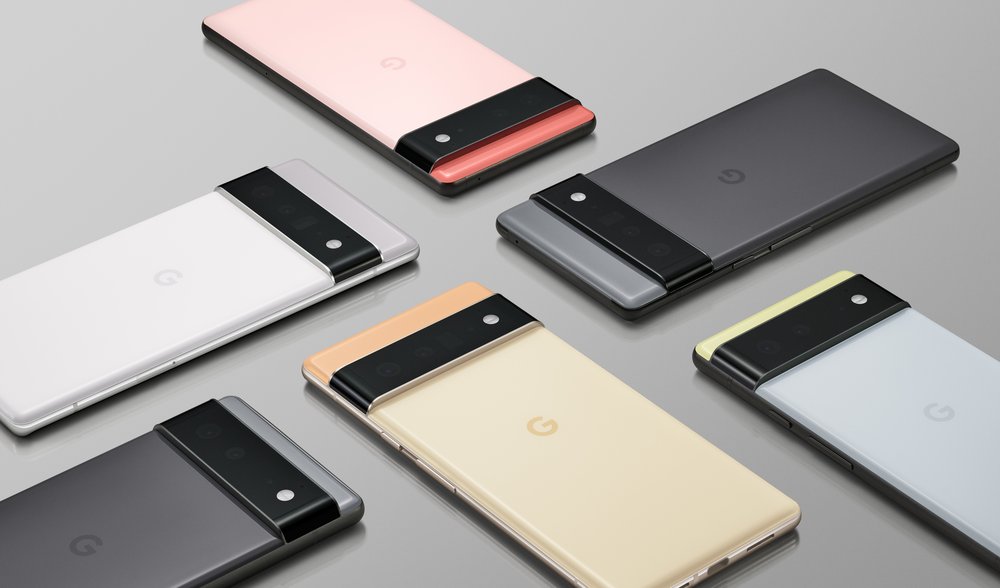
But I still have a problem. Where’s the centerpiece, the masterpiece of this whole thing? I speak, of course, of that marvelously designed camera bump.


Now isn’t that pretty?
Google
I haven’t seen it in person, but every image of the back of the phone makes it truly stand out, in a semi-Bauhaus kind of way.
Where the backs of too many phones are now garlanded with large circles that make them look like old-fashioned electric shavers, here’s Google genuinely showing that the camera mounting can look different and even quite beautiful.
But it’s not in the video. At all. Why? I’m hurt.


