There is a new way to explore the National Renewable Energy Laboratory’s (NREL’s) famous chart spotlighting the efficiency of solar cells.
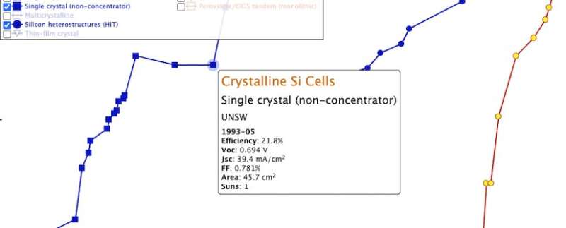
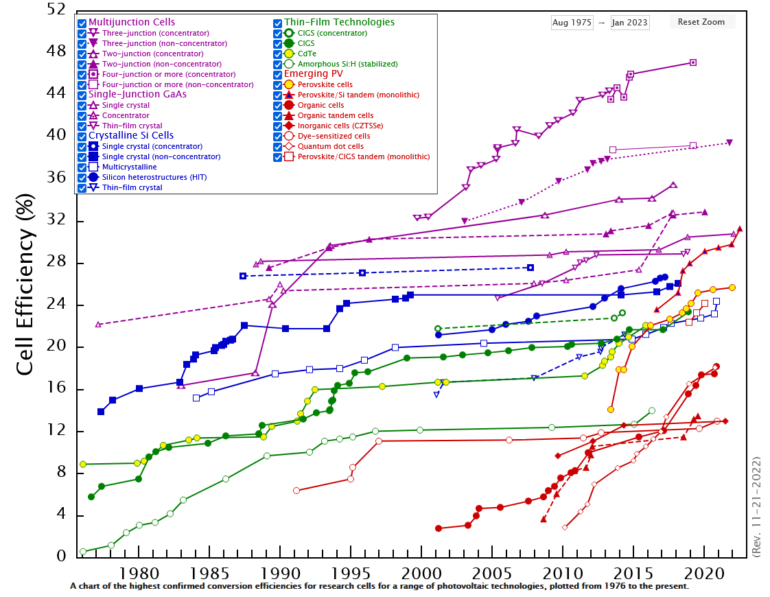
The Best Research-Cell Efficiency Chart is now interactive, with the ability to pull up decades of research data and create custom charts that focus on specific technologies or time periods. You can also dive deeper into the data behind many points on the chart, going beyond just efficiency.
“There’s much more than just the efficiency of a solar cell,” said Nikos Kopidakis, a physicist at NREL who oversees the regularly updated chart. “There’s the current, the voltage output, and other parameters and who made the cell. In most cases, now you can mouse over and there is a pop-up showing you additional parameters for that cell. It’s more informative.”
The interactive companion chart can zoom in to a specific time period and create technology-specific charts or charts that compare specific technologies.
All that underlying data is also available in a full data file, for those who want to dive really deep.

By mousing over an individual point on the interactive cell efficiency chart, users can see more details about that record cell. The availability of details will vary from point to point depending on what information NREL has in its records. © National Renewable Energy Laboratory
The Best Research-Cell Efficiency Chart stands out as being among the most-visited page on NREL’s website. The chart contains information on a range of different photovoltaic (PV) cell technologies as they have been discovered and developed over the last 50 years. It has tracked the incremental but consistent improvement of traditional solar cells, such as those made from silicon. And it has also documented the exciting rise of some emerging technologies, like perovskite solar cells.
Until now, the information available from the chart was limited to the efficiency of a cell and the name of its maker and could only be downloaded as a PDF. Now, users can customize which technologies appear, explore the data behind each point, and export their own customized versions of the chart. The static chart will also remain available. Updates to it will be made regularly. For the moment, no changes will be made to the companion Champion Photovoltaic Module Efficiency Chart, which contains far fewer data points.
By mousing over an individual point on the interactive cell efficiency chart, users can see more details about that record cell. The availability of details will vary from point to point depending on what information NREL has in its records.
The cell efficiencies are measured by independent testing centers—NREL is among them—before earning a spot on the chart. It has a long history and strong reputation within the PV research community.
“It’s possible that the NREL efficiency chart is the most presented graph that you can find at the annual PV Specialists Conference and similar conferences,” said Sarah Kurtz, an NREL Senior Research Fellow and University of California–Merced professor. “But it has gotten so full that it’s difficult to see the data. With the new interactive chart, researchers will be able to still use the data, but present it in a way that communicates better for their talk.”
Kopidakis took over responsibility for the chart three years ago. The originator of the chart, Keith Emery, began measuring and charting the efficiencies of solar cells in 1980 when NREL was known as the Solar Energy Research Institute. Before then, the measurements were the responsibility of NASA, which used the technology to power satellites and other spacefaring craft.
Provided by
National Renewable Energy Laboratory
Citation:
Popular NREL cell efficiency chart shines in new interactive version (2022, November 21)


