Apple is big about the user experience. But sometimes it falls victim to the exact same nonsense that I see other companies do.
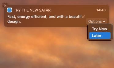
I present to you Exhibit A this popup:
Why Apple, why?
Seems innocent at first. I dismissed it, thinking I’d never see it again.
Oh on. Apple wants me to see this.
Possibly until the end of time.
Check this out: OnlyKey: The ultimate security key for professionals
Now OK, it’s a small thing, one click, and it’s gone. But my real problem with it is that it is using MY notification area, a place that I have spent time customizing and curating to show me what I want to see.
This notification adds unwanted junk to that are, and makes me either want to ignore all the popups, or turn them off (not sure if that would kill the Safari popup).
So, Apple, if you want me to use Safari, make a compelling point, make it a maximum of one (and I personally think it is bad form to do it even once), and then go away.
Don’t want to give me that respect? Then make one of the options a Never again. Not a Later.


This is stupid
I’ve pulled up Apple on this sort of nonsense in the past, and while macOS still does this less than Windows, this feels like a slippery slope where we are going to end up with popups for all sorts of things.
Why do I think this is a slippery slope? I hate the fact that Apple sells ad space in the App Stores. It makes them look cheap and allows someone else to pay to get between me and the thing I’m looking for.
For a company that pulls in the sort of money Apple does, and for a company that charges as much as Apple does for products, I’d really expect them to be free of all this baloney.


