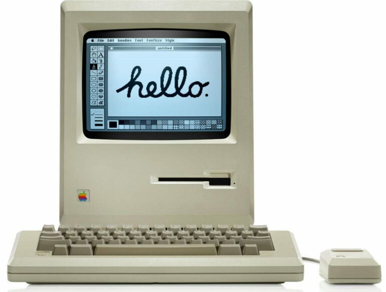
Technology innovation requires solving hard technical problems, right? Well, yes. And no. As the Apple Macintosh turns 40, what began as Apple prioritizing the squishy concept of “user experience” in its 1984 flagship product is, today, clearly vindicated by its blockbuster products since.
It turns out that designing for usability, efficiency, accessibility, elegance and delight pays off. Apple’s market capitalization is now over US$2.8 trillion, and its brand is every bit associated with the term “design” as the best New York or Milan fashion houses are. Apple turned technology into fashion, and it did it through user experience.
It began with the Macintosh.
When Apple announced the Macintosh personal computer with a Super Bowl XVIII television ad on Jan. 22, 1984, it more resembled a movie premiere than a technology release. The commercial was, in fact, directed by filmmaker Ridley Scott. That’s because founder Steve Jobs knew he was not selling just computing power, storage or a desktop publishing solution. Rather, Jobs was selling a product for human beings to use, one to be taken into their homes and integrated into their lives.
Apple’s 1984 Super Bowl commercial is as iconic as the product it introduced.
This was not about computing anymore. IBM, Commodore and Tandy did computers. As a human-computer interaction scholar, I believe that the first Macintosh was about humans feeling comfortable with a new extension of themselves, not as computer hobbyists but as everyday people. All that “computer stuff” – circuits and wires and separate motherboards and monitors – were neatly packaged and hidden away within one sleek integrated box.
You weren’t supposed to dig into that box, and you didn’t need to dig into that box – not with the Macintosh. The everyday user wouldn’t think about the contents of that box any more than they thought about the stitching in their clothes. Instead, they would focus on how that box made them feel.
Beyond the mouse and desktop metaphor
As computers go, was the Macintosh innovative? Sure. But not for any particular computing breakthrough. The Macintosh was not the first computer to have a graphical user interface or employ the desktop metaphor: icons, files, folders, windows and so on. The Macintosh was not the first personal computer meant for home, office or educational use. It was not the first computer to use a mouse. It was not even the first computer from Apple to be or have any of these things. The Apple Lisa, released a year before, had them all.
It was not any one technical thing that the Macintosh did first. But the Macintosh brought together numerous advances that were about giving people an accessory – not for geeks or techno-hobbyists, but for home office moms and soccer dads and eighth grade students who used it to write documents, edit spreadsheets, make drawings and play games. The…


