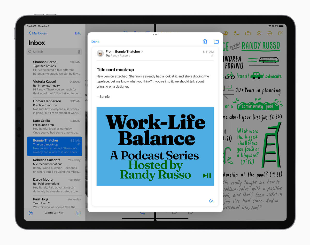
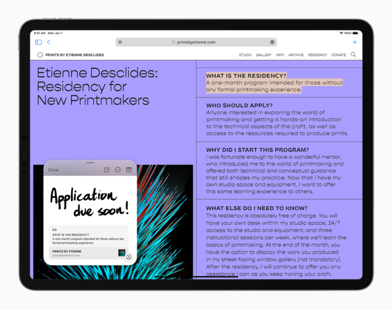
The Quick Notes feature implemented on iPadOS 15
Jason Perlow/ZDNet
Apple on Wednesday released the first public beta of iOS 15 and iPadOS 15 for anyone to help test the upcoming software update that will power millions of iPhones and iPads. You can sign up for the public beta if you’re willing to deal with frequent updates, bugs, and poor battery life.
Apple first announced the new operating systems in early June at WWDC 2021, and it also released them as developer betas. I’ve been using the developer betas since they were made available on my iPhone and iPad. There are plenty of changes on both operating systems to write a book about — but, for now, I want to start with my first impressions of the iPadOS 15 beta, specifically.
As you go through the areas of the update I like, and what I think needs some work, keep in mind that iPadOS 15 is very much still a beta. Apple can and will make plenty of changes before the official release this fall — and that’s a good thing.


Multitasking
Multitasking, or using more than one app at the same time, has been possible on the iPad since the release of iOS 9 in 2015. If you knew about it, you often struggled to remember features like Split View (using two apps side-by-side) or Slide Over (using an app that hovers above whatever apps are open on your screen) even existed. It wasn’t obvious how you moved an app from Slide Over to Split View or vice versa.
With iPadOS 15, Apple has added a small button that lives atop every app window. Tap or click on it, and you’re given a few different options for that particular window. The Multitasking control button will let you move an app into Slide Over, Split View, or Full Screen without any extra fuss or gestures.
If you already have an app open full screen and you tap or click on the multitasking button and select Split Screen, the app’s window will move off the right side of the screen, allowing you to pick a second app to use from your home screen or App Library. Select a compatible app, and a second later both apps will be open and ready to use.
Another frustration I had with iPadOS and multitasking before iPadOS 15 was that you never knew exactly which app’s text field was active, and I would always start typing in the wrong window. Thankfully, I never sent a message to the wrong person or whatever embarrassing thing could happen.
But, with iPadOS 15, that multitasking button that’s so critical? It also indicates which app is active and will receive any text input. It seems, early in the beta process at least, that Apple has fixed multitasking by making it easier for users to find, learn, and use. For me, personally, I’ve known about all of the gestures and methods to use multiple apps at the same time, but now, instead of sometimes having to take a second or two to think about what I want to do with an app, I’m able to click on the multitasking button, click on where I want the app to go, and it’s done.
Well done, Apple.
Quick Note
Quick Note is a new feature I’m still trying to learn, but it’s one that I can see working itself into my daily workflow. When opened — either by pressing the Globe key + Q, swiping up from the bottom right corner of the screen with an Apple Pencil, or via Control Center — a small window shows up on the iPad’s screen. That window is connected to the Notes app, but it doesn’t simply serve as a small text box to jot down your thoughts.
Yes, you can use it for quick notes, but you can also use it to save links to websites, emails, messages, or even photos just by clicking or tapping on a button. When you want it to get out of your way, you can slide it off either side of the screen and then drag it back in when you want to add more information.
I look at it as more of a smart sticky note. It lets me keep random ideas and thoughts in a single spot, but it also will link out to what inspired each idea, providing context.
Each item is saved to the Notes app for quick access and searching in the future.
Home screen improvements
When Apple released iOS 14 with widgets on the home screen and an app drawer called App Library, everyone, including yours truly, assumed the iPad was also getting the same treatment. That wasn’t the case. Instead, we had to wait for iPadOS 15 for the iPad lineup to get those same features, including a new larger size widget. Being able to place widgets anywhere on the home screen and limit the number of home screens littered with single-purpose apps makes the iPad feel much more like a more modern operating system than the rigid app and folder grid of iPadOS’ past.


The new Safari looks fantastic, but bring back some buttons
I’m all for minimal design, which is exactly what Apple is doing with the new version of Safari in iPadOS 15. I’m probably in the minority that, after a few weeks of testing, the new design is something I’m fond of.
But there’s a big problem with it. The update to Safari on the iPad mirrors that of Safari in MacOS Monterey and somewhat iOS 15, where almost all of the standard buttons and controls users have easy access to in iOS 14 and earlier have been moved to a small menu button. The refresh button? Gone. You can swipe down on a webpage to refresh it or tap the menu button then select refresh. The same goes for the share button, should you want to send a webpage to a friend in your favorite messaging app.
In the second developer beta, Apple added a refresh button that shows up when you’re using a mouse or trackpad and you hover the pointer over the address bar.
Hopefully, as the beta progresses and we get closer to the final release this fall, Apple will figure out a happy medium of minimalism and usability. Too many features are now hidden behind the menu button, and it doesn’t get any better on the iPhone.
Keyboard shortcuts in Safari are… confusing
Speaking of Safari, the new keyboard shortcuts are confusing. Hopefully, it’s just a bug as Apple works through mapping multitasking keyboard shortcuts to the iPad’s Globe key. (If you have a Magic Trackpad and are on iPadOS 15, hold the Globe key to view a list of all the navigation shortcuts. There are many.)
For example, I used to be able to hold in Command + Shift + an arrow key to jump to the beginning or end of a line of text and highlight it at the same time. Now, that keyboard shortcut seems to have a random function depending on what site I’m using. For example, when editing in Google Docs, it works just as it always has. However, when I’m on almost any other website, it either goes back one page or switches between open tabs. The first option isn’t ideal and has cost me lots of work.
The same goes for Command+S, which prompted a website I frequently write in to save my work, now prompts me to download a copy of the webpage I’m currently viewing.
Maybe it’s something that website developers need to implement on their end? If so, I hope Apple communicates the change so people like me, who do a lot of work on the iPad, aren’t forced to relearn years of muscle memory — memory that works in standard apps like iA Writer — right now.
If you’ve been using the developer beta, or take the public beta plunge, I’d love to hear what you think about it. Let me know in the comments below.


