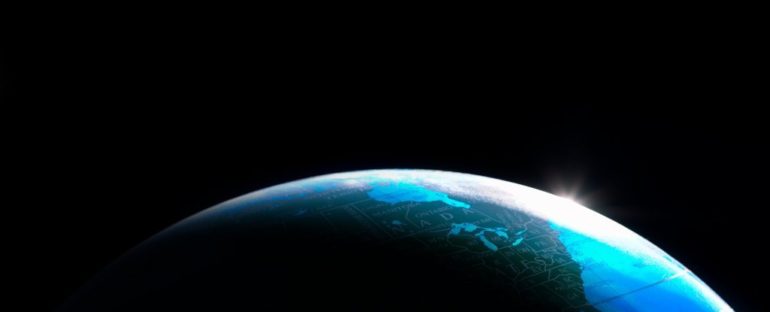
Admit it. We all have our favourite world maps, the one where the continent we call home sits right at the centre. And when that world map is flipped upside down or shifted to the left or right, everything feels… unbalanced.
More than just a classroom squabble, it’s a reflection of how maps can shape how we view and understand the world.
Now a group of researchers has reimagined our planet and created a double-sided map – round, not unlike the Earth, but also flat like a pancake – in an attempt to give us a less distorted view of the world.
“We’re proposing a radically different kind of map,” said Princeton University astrophysicist J. Richard Gott, who designed the new spread with mathematician Robert Vanderbrei and physicist David Goldberg from Drexel University in Philadelphia.
The trio set out to make a flat map with the least error possible after creating a system to score existing maps on how lopsided or skewed they are, and how much areas and distances on the maps were bent out of shape.
“We believe it is the most accurate flat map of Earth yet,” the researchers wrote when they published their methods on pre-print website arXiv.org ahead of peer-review. You can check out their efforts below.
“Any flat map of the sphere cannot be perfect, but ours does much better than previous maps at minimising the errors in local shapes, areas, bending, lopsidedness, distances, and boundary cuts,” Gott told ScienceAlert, who bettered his last effort in the process.
With satellite technology, airborne lasers, and big data mash-ups, scientists today are well-equipped to map all sorts of things, from forests breathing carbon and continents on the move to how humans have wreaked havoc on Earth.
But they are still grappling with how to turn our Christmas bauble of a planet into a flat map. Because as much as we’d like maps to help us visualise the way things are, they also distort the world immensely.
It’s mathematically impossible to represent the surface of a sphere as a flat map without some form of distortion, so map makers have to swing a few mathematical tricks to faithfully represent some Earthly features while sacrificing others.
Some world maps are designed to preserve the shape of countries (called Lambert Conformal Conic projections), whereas other maps – those globes that bulge at the equator – preserve area. These are Mollweide projections.
Overlaying hundreds of maps at a time shows just how distorted the world gets when map makers try to flatten out the globe, as data scientist Michael Freeman, from the University of Washington Information School, reveals in this interactive visualisation:
Fun interactive tool by @mf_viz allows us to overlay hundreds of map projections at a time. A great visual way of understanding the distortion of maps. Areas along the equator stay much the same of course. Source: https://t.co/8VpoQPaU7j pic.twitter.com/jPeCnOOkEG
— Simon Kuestenmacher (@simongerman600) February 16, 2021
From the maps we have already, the best all-rounder is a compromise. Known as the Winkel Tripel projection, and used by National Geographic for its world maps, it minimises distortion to area, direction, and distance.
Although, it’s still not perfect, because the Pacific Ocean is cut between Japan and California, making it look far wider than it really is.
More recently, American architect Buckminster Fuller and Japanese artist and architect Hajime Narukawa both tried unfolding the world in different ways. Others are just having fun fanning out Earth like an orange peel.
This new map, a two-sided flat disk, was created using an entirely different approach again.
“We are essentially squashing the globe, as if we had run over it with a steamroller,” Gott told ScienceAlert.
It gives a more accurate representation of the world than existing flat maps, the researchers say – by their own score.
“Our map is actually more like the globe than other flat maps,” Gott says. “To see all of the globe, you have to rotate it; to see all of our new map, you simply have to flip it over.”
The Northern and Southern Hemispheres can be placed on either side, with the equator around the edge, as you can see below.
“This is a map you can hold in your hand,” says Gott, who reckons people might like to print it out on plastic or cardboard, which could be appealing to any avid hiker or city sightseer who knows all too well that paper maps expanded to arm’s length never quite fold back together the same way.
The double-sided disk map. (Gott, Vanderbei & Goldberg)
“We have continuity over the equator,” Gott goes on to explain. “Africa and South America are draped over the edge, like a sheet over a clothesline, but they’re continuous.”
This means distances across oceans or across poles are both accurate and easy to measure, the researchers say, so it could be a useful tool for teaching kids about the world.
Even with its improvements, there are still some distortions with this disk map, just not as big as with other projections. Areas at the edges are 1.57 times larger than at the centre, and distances can be out by around a fifth.
“No regular one-sided flat map can do that,” Gott said.
Who knows if it will become a classroom sensation, or end up filed away in a box like your old CD collection? But at the very least this map puts a new spin on the term flat-Earthers.


