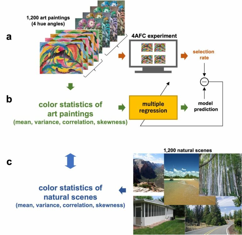
A research team led by Professor Shigeki Nakauchi of Toyohashi University of Technology conducted an experimental study of the color composition preferences of 31,353 participants, for a total of 1,200 paintings with artificially manipulated color compositions. The group also identified the statistical color composition properties of the paintings to examine trends therein.
Common trends in color composition patterns (statistical properties) were observed regardless of genre, and people were found to prefer color compositions closer to these patterns. It was posited that such preferences for original color compositions are mediated by their similarity to natural scenes that we observe in our daily lives; however, systematic differences were observed between the color compositions of the paintings and those of natural scenes, indicating that the use of color in paintings is unique and does not resemble the occurrence of colors in nature.
In addition to predicting color composition preferences, the results of this study may provide clues to fundamental questions such as why people are attracted to certain color schemes, and the nature of preference and attraction.
Color is one of the most influential features in determining our preferences. Beauty, as the saying goes, is in the eye of the beholder, and preferences differ from person to person.
However, a research group led by Professor Nakauchi of Toyohashi University of Technology has recently conducted a study indicating that many people prefer the original color compositions used by artists compared to fake ones with an adjusted hue—even for paintings that they have never seen before. Nevertheless, the mechanisms that determine why people prefer certain color compositions and the universal features of painting color compositions remained unexplored.
In this study, the researchers began by measuring preferences (selection rate on the four-alternative forced-choice task) among more than 30,000 participants for 1,200 paintings presented in four forms: their original form and three “fake” forms where the hue angle was rotated by 90, 180, and 270 degrees.
Next, twelve types of statistics (mean, variance, correlation, and skewness) were calculated to represent the distribution of colors in the 4,800 images used, and correlations between these color statistics and the selection rate, which indicates the level of preference of the image (what percentage of participants preferred it), were examined using multiple regression analysis.

Comparison of the distribution of color statistics for paintings and natural scenes. © Toyohashi University of Technology.
The results revealed that the percentage of people who preferred an image was linked to its statistical color properties. In particular, asymmetric red–green distribution (skewness of a*), correlation between lightness and blue–yellow distribution (L* and b*), and correlation between red–green and blue–yellow (a* and b*) were found to be associated with preference.
So, why are these particular color statistics related to color composition preferences? Professor Nakauchi’s research group focused on the “matching-to-nature” hypothesis, the idea employed by many previous researchers that the color compositions found in paintings resemble those of natural scenes.
From this idea it can be inferred that painters unknowingly embed in their paintings the features of natural scenes that we often see in our daily lives, which is why participants favored original color compositions over “fake” ones, in which the natural characteristics are lost due to the hues being rotated.
If this hypothesis is correct, then the key color statistics that are closely related to preference, as revealed by the preference test and multiple regression analysis, ought to be similar to those found in natural scenes. To test this hypothesis directly, the researchers identified the color statistics of 1,200 natural images without man-made objects or people and compared these to the color statistics of the paintings.
The results showed that the distributions of the statistics pertaining to color composition preferences systematically differed from those of the natural scenes. In other words, it was revealed for the first time that color compositions found in paintings do not simply imitate natural scenes, but have their own unique features, which is linked to preferences of observers and the attractiveness of certain color schemes.
This discovery of color statistics linked to color composition preferences may enable the attractiveness of color compositions to be inferred from color statistics, not only in paintings but in a wide range of objects. The findings are also expected to stimulate new research aimed at answering fundamental questions such as what kind of biological values are involved in attraction to certain color schemes.
The research was published in Scientific Reports.
More information:
Shigeki Nakauchi et al, Regularity of colour statistics in explaining colour composition preferences in art paintings, Scientific Reports (2022). DOI: 10.1038/s41598-022-18847-9
Provided by
Toyohashi University of Technology
Citation:
Color composition preferences in art paintings are determined by color statistics (2022, September 27)